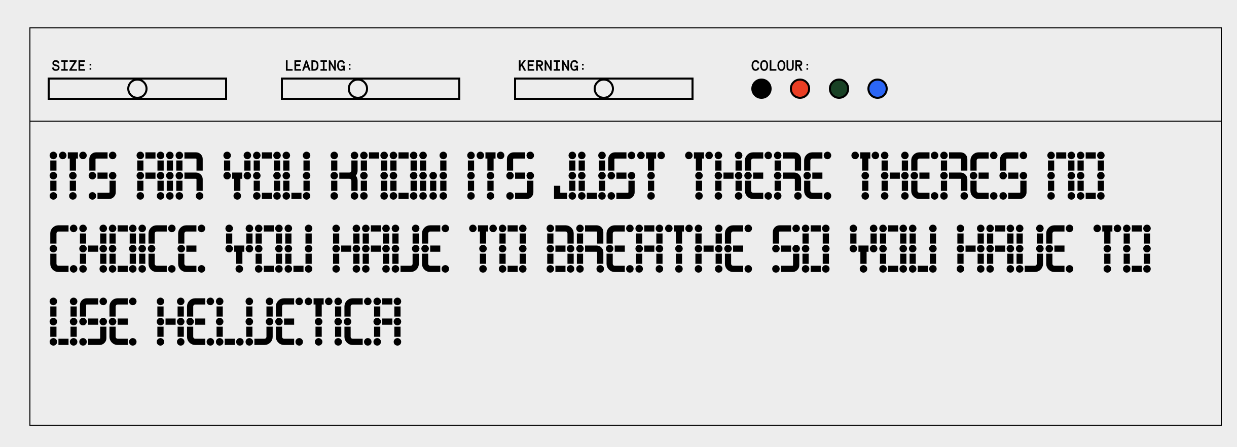
Couple final little changes here, flicking between this and the home page you can notice a lack of visual consistency. The border around the title and sections is nicely tying the design together.
With that in mind also made a small change to the font tester section.
Again feeling more connected, I think the total strip back was nice but a little too minimal in the end, since changing the headline copy too, this border situation is creating a consistent flow.

• Setting a min-width for the columns to ensure the amount of words on one line stays legible and clear.
• Setting up the Rev animations to make sure they're not overlapping and have a nice spacing in-between the copy.
• Been a lot of focus on it so of course it's natural it looks a a bit shitty to me.
Seee video