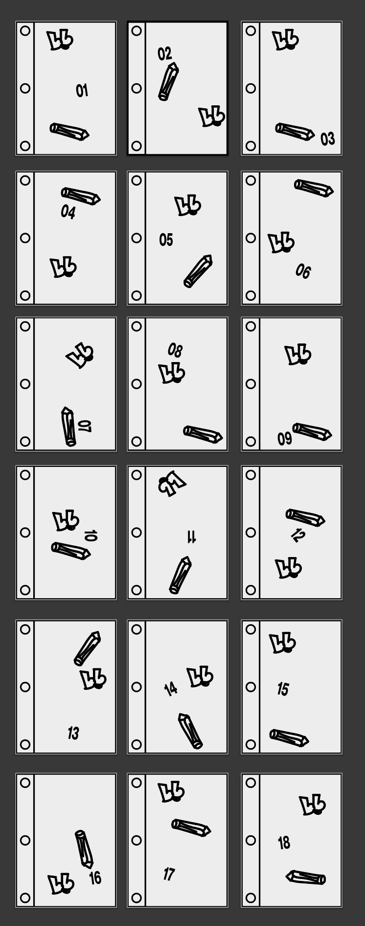
Worked on the journal page over the last couple of days and now unironically journalling about it.
Each entries icon has a minor nuance in the design. Fun to just play with the positioning of the elements to create unique designs and infinite variations. Reminds me how important it is not to get wrapped up in possibilities.
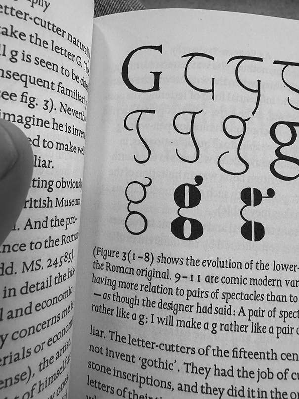
On the train home found an amazing quote in 'An Essay on Typography' by Eric Gill. Talking about the evolution of lower case G and how it looked like a pair of spectacles. Maybe some fun Bloopy design exploration in that 🤔

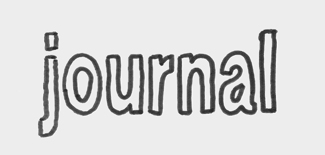
p.s. also did a quick trace for the title of the journal page
Night Night xx

Made a couple of options for the new face, think the selected one as a very concerned expression at the moment - make more friendly me thinks.
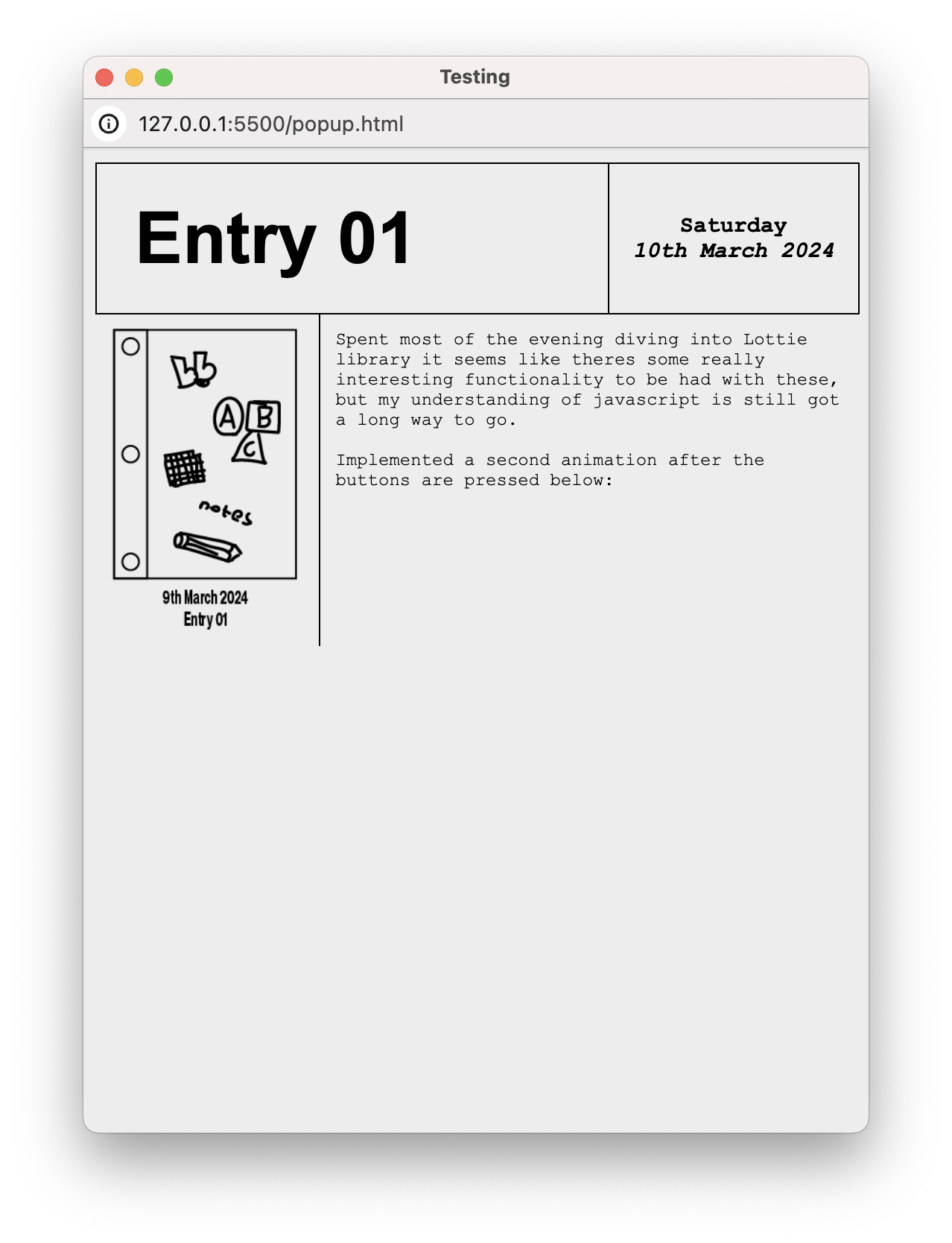
Finally, designed the layout of the pop up journal pages. It's simple but managed to code it all without the use of ChatGPT so was pretty happy with that. Definitely learnt something :]]


