Just trying to recap over all the developments over he last week is pretty difficult, haha.
Starting from what I think, I think is the beginning on Wednesday morning. Sorry rewatching the videos to recap. Okay, I mean the order is not that important actually, many things were done.
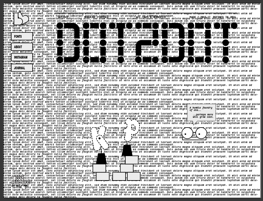
Reworked the font header on the home page, It's a type foundry after all and this should be up at the top of the hierarchy immediately drawing attention. As such the size of this has been increased quite significantly and given a little animation showing the construction from dot 2 dot. Oh yeah I also named the font at some point, dunno feels cute it's simple clean and “makes sense” to quote Leon's reaction.
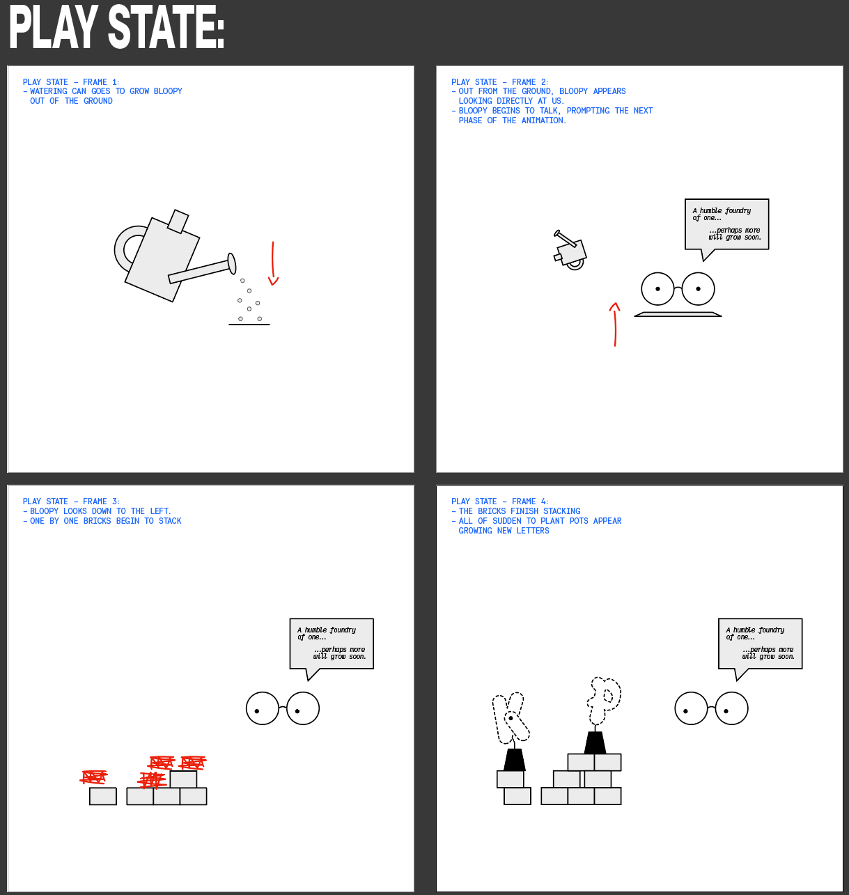
Following this I got stuck back into Rive to implement the new Bloopy design. This involved doing some initial redesigning of the flower pots, designing a couple of 'under construction letters' from typefaces in the works. Also Bloopy now has his eyes follow the cursor around the page, it's really fun! Surprised it works, button notta gonna complain.

Following this headed to replicate on the fonts page… At one or another stage the type specimen was cleaned up with the vertical slider, which I discovered was discontinued from use in web due to it preventing scrolling especially on touch screens, nightmare anyway I'll get to that fix in a later post.
I digress, Bloopy and the download button has been revamped, in addition to the d2d (dot2dot) page being balanced out design wise. A big theme/step as I'm approaching the final stages has been getting things to be responsive and its becoming clear why it was foolish to leave this stage to the end and design for mobile first. Despite totally ignoring this best practice, I'm persevering through this self inflicted drudgery.
At some point also I think the copy was updated for the d2d page, I had written this a while ago, but it's holding up okay. It's nice having these links and references added on the site, imagine I'll enjoy reflecting on it all.
