About page refinement time, with my head back in the land of Rive was able to make some tweakments to these animations to make sure they were balanced with the rest of the design langauge of the site.
Or in css terms,
border: 2px Solid Black;
Was working with the layout of this page for some time just faffing about with different combinations of layout and referring back to some early Willie Fleckhaus references. Using some of the inspiration and knowledge and that kind of thing from my experience in Graphic Design to give this more of an editiorial feel on the web, make it flow and all that nice stuff.
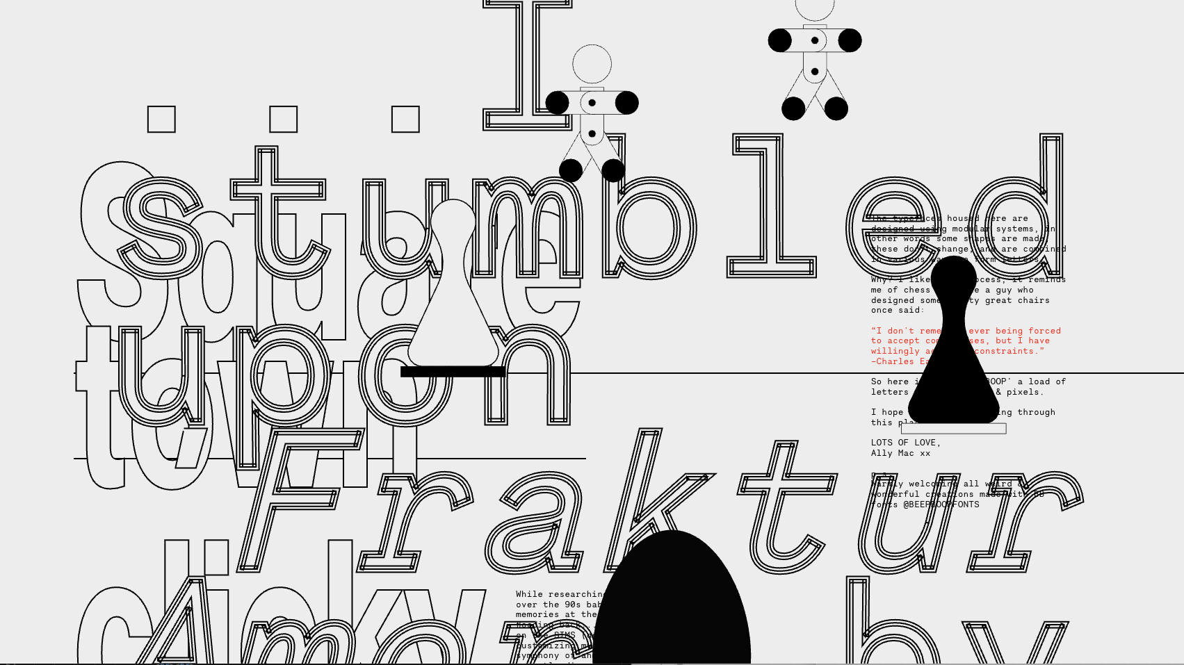
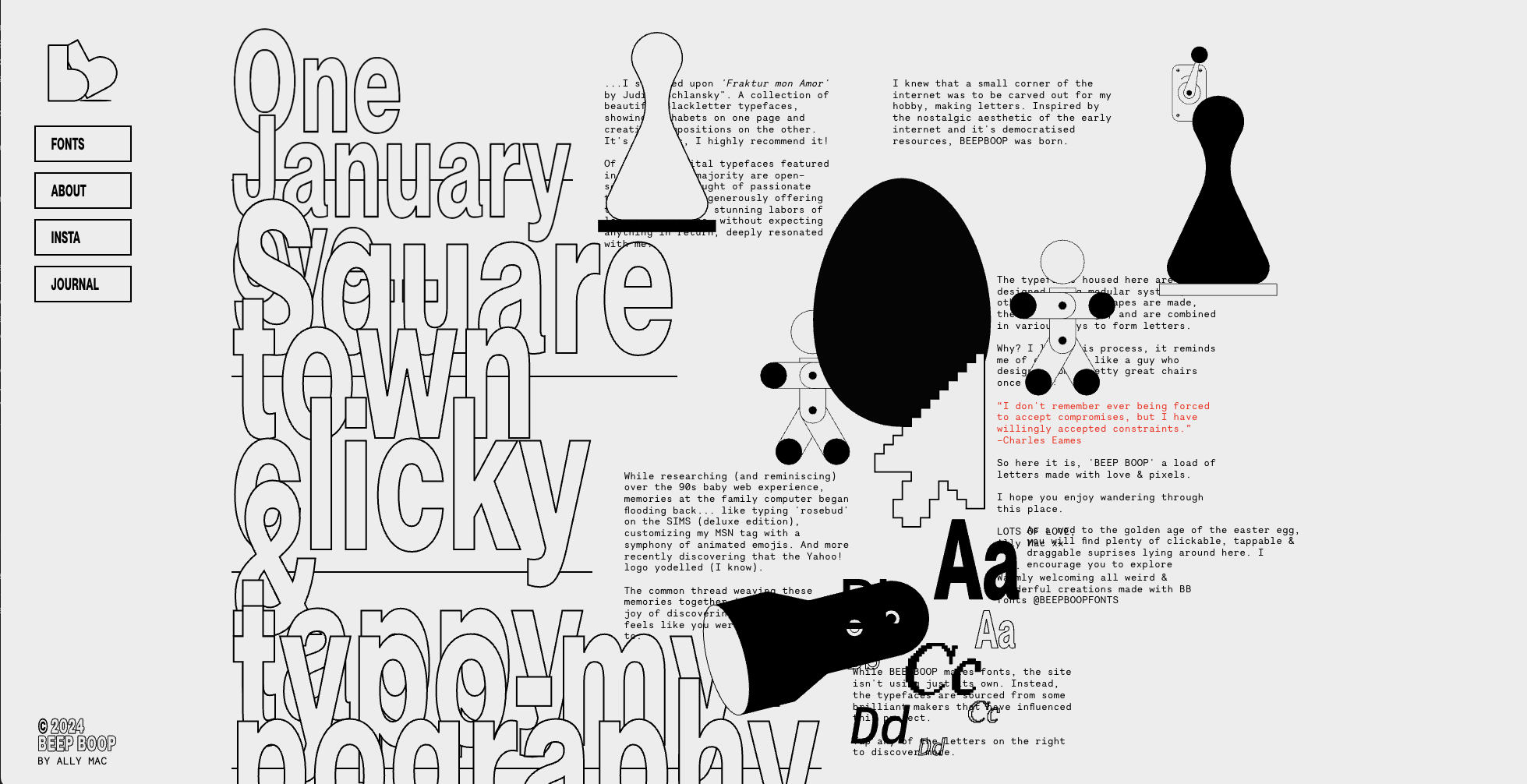
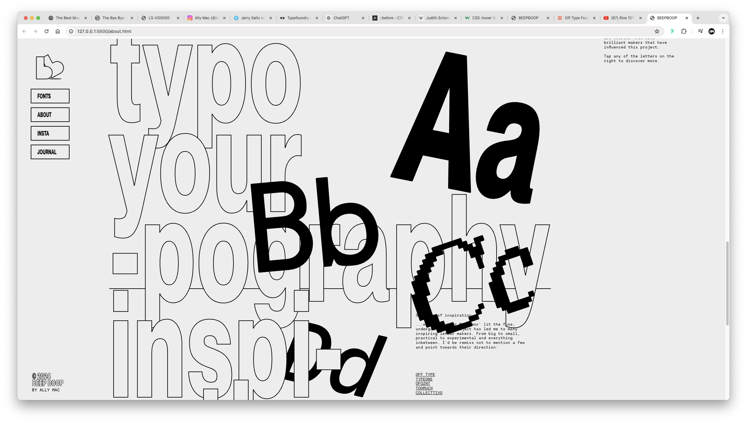
I certainly stumbled across some interesting things along the way, see some screenshots around.


I ended up settling on this not so interesting layout. As it maintains some important design rules and to be honest I’m just not willing to fight the battle of having to hard code all of the placements just to have it be completely higgled piggldy when you resize the browser a little bit. Yet again the responsive design coming to bite me in the bottom.
The design isn’t screaming shiny shiny polish, which is OKAY! At the same time there’s a rhythm to it, I like how the titles are large and how they work with the illustrations. It feels friendly, playful, unpolished, unique, approachable, early internet vibes. I’m satisfied at this moment in time 🥲
Perhaps there is an opportunity to really figure out replicating some of the beauty in editorial design on the web, the problem is html is not a canvas with the same flexibIlIty as an inDesign or an Illustrator. Also I feel fundamentally you have to understand the rules and play by them before you can properly break them and I'm not there yet.
I think some of the coding accidents throughout the process of finalising this page document a good rule break, like okay everything is aligned and connected in some way, but now it’s fucking all overlapping and layered and interesting.