Had always intended to tidy up the Journal page, but ended up getting a little carried away with the whole thing ✏️
So the drag and drop is really cool and I’m not throwing it in the bin, however with the number of entries stacking up by the second it was a bit too much. Not the messiness was a bad thing, it was just out of control.
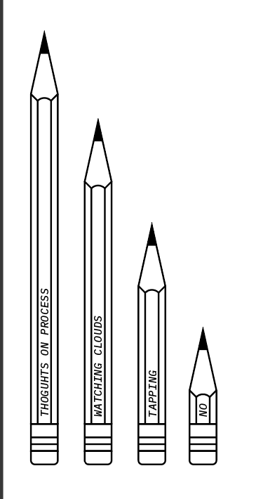
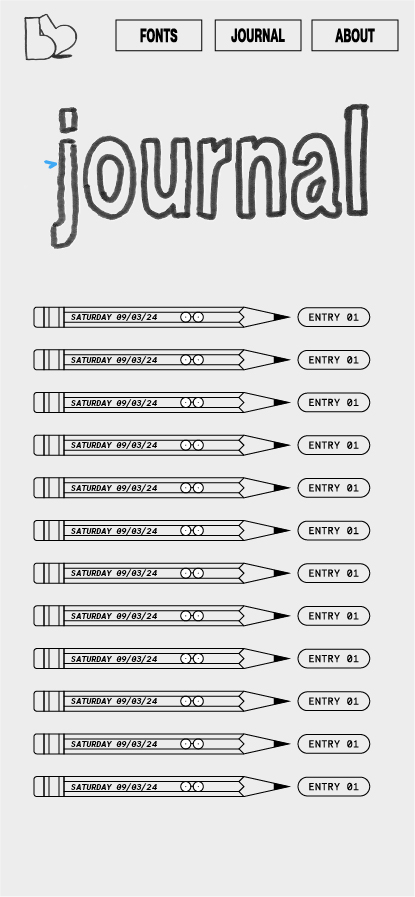
Opted for these cute little pencils, which feel like they belong to Bloopy’s universe. The body of pencil proved to be a natural place to put the date and that was that.


Create a a wobbly jitter for the Journal title with tracing paper and 3 states. It gives a nice human aspect to an otherwise well organised list of things, to maintain an imperfect feel that this page always intended to have. (This is reflected in the logo as well).
For the entries, all imagery and content is a lot larger. This move seems obvious in hindsight. It’s giving sketchbook. 📓